Οι τάσεις στο Graphic Design βοηθούν να δημιουργήσετε works that communicate and connect with the public in a timely manner. Following and understanding trends means you are aware of the dynamic landscape of graphic design and respond to people's evolving interests.
In addition, trends often evolve in parallel with developments in technology. Designers are adapting their styles to take advantage of new tools and techniques, and keeping up to date ensures that designs are optimized for the latest platforms and technologies. At its core, adopting trends in graphic design is a strategic way to stay relevant, exciting, and tech-savvy in the ever-evolving design space.
Without further delay, we present 4 Graphic Design Trends for 2024 selected by the digitalpro team.
1. Doodles (sketches)
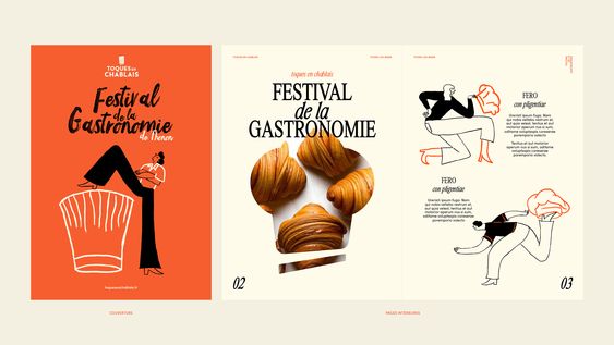
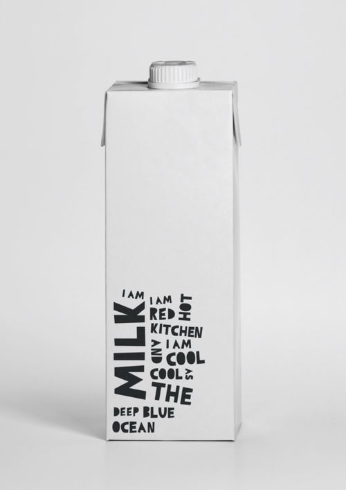
The trend in graphic design of handmade designs, also known as handmade art, highlights the "human" in design. It derives from the idea that handmade elements transmit warmth. More and more companies have recently adopted this style to create a friendly, approachable image. You can use this versatile style to create designs on print and digital media, from outdoor flags to social media graphics.
Tip: The combined use of handmade elements with a minimalist design and layout can create a modern and unique corporate identity.
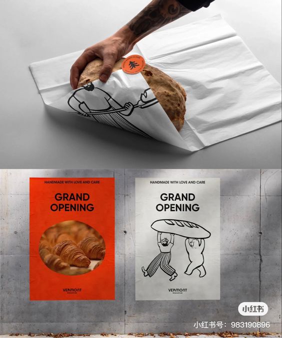
These handmade, often playful and spontaneous illustrations add a touch of human personality to the brands. The doodles εμπνέουν τα σχέδια με ένα αίσθημα αυθεντικότητας, σαν χειροκίνητη δουλειά του καλλιτέχνη είναι ακόμα σε εξέλιξη. Από τις άκρες των τετραδίων μέχρι τον ψηφιακό καμβά, τα doodles προσκαλούν την παιχνιδιάρικη διάθεση και τη δημιουργικότητα στον σχεδιασμό.
They can be subtle or take centre stage, depending on the message and the mood. This trend echoes the endless allure of handmade styles in a world dominated by digital precision. The sketches remind us that design need not be rigid. It can be spontaneous, free and highly attractive. As we travel into 2024, be ready to embrace this design trend of the unpretentious and endearing world of doodle and other hand-drawn illustration styles, where every line you draw is a unique experience of imagination and character.
2. Bold Minimalism
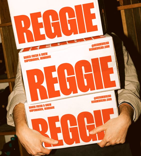
Minimalism, an eternal and enduring trend in graphic design for 2024, will probably never go out of fashion again. This philosophy of "less is more" has gained even more emphasis recently. In this approach, each element in the design serves a purpose, stripping away the unnecessary to reveal the essence. Minimalist designs are characterized by clean lines, plenty of space and an uncluttered aesthetic.
This trend not only brings a sense of elegance and simplicity to the forefront, but also promotes effective communication. With a limited color field and an emphasis on typography, minimalism allows designers to convey a message accurately. Its adaptability to a variety of media, from websites to corporate identity communications, makes it a flexible choice for design projects.
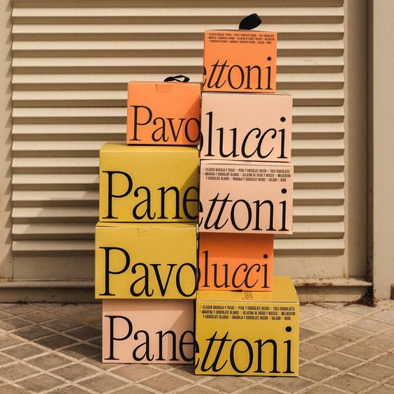
As we move into 2024, minimalism reminds us that sometimes, in a world of noise, a whisper can be much louder than a scream.
3. Utilitarian design (utility design)
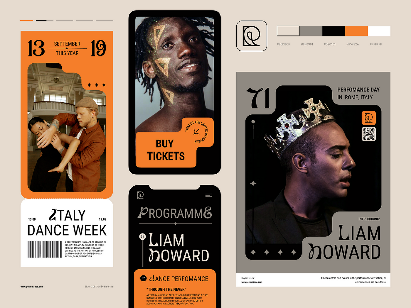
Ο "Beneficial design” χαρακτηρίζεται από τη λειτουργικότητα. Αυτή η τάση στον σχεδιασμό έχει αποκτήσει δημοτικότητα φέτος, καθώς μπαίνουμε σε έναν ολοένα και περισσότερο ψηφιακό κόσμο. Καθώς μεγάλο μέρος της ζωής μας πραγματοποιείται στο διαδίκτυο, είναι σημαντικό οι ιστότοποι και οι εφαρμογές να είναι εύχρηστες και εύκολες στην πλοήγηση.
Beneficial design focuses on simplifying the user experience by removing unnecessary elements. This can be achieved through minimalism, clear navigation and content that is easy to understand. Designing something in this way immediately creates a specific, strong character and confidence in quality. In this trend there are recognisable elements that can be found in vehicles, tools and manuals.
Tip:
Harness the power of the Utilitarian design trend by prioritising functionality and simplicity in your designs, focusing on clear communication and user experience. Use clean lines, minimalist elements and purposeful color combinations to create designs that seamlessly serve their intended purpose with efficiency and aesthetic appeal.
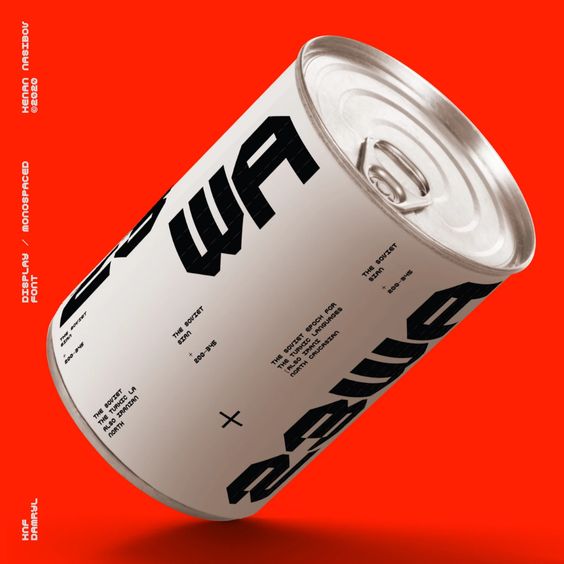
4. Experimental Typography ("experimental" typography)
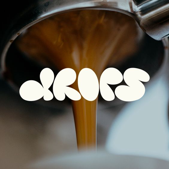
Font choice is important for your branding and "experimental" typography pushes the boundaries of the norm.
Designers are no longer constrained by limitations. Although the alphabet, the number system and symbols are all defined by convention, this trend promotes thinking outside the box and tests the boundaries.
Typically, typography is structured within a grid so that all elements are placed in a uniform manner. Whether it is centered, grouped in headings, or aligned to the right, the font is usually arranged in this organized manner. Experimental typography subverts this usual scenario.

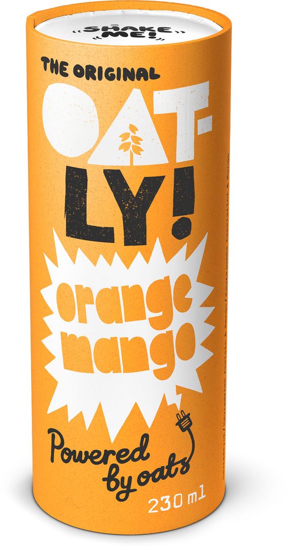
The rapid evolution of technology allows designers to experiment more with fonts and not follow the "norm". What makes this trend different is that it empowers designers to upgrade the way they work and apply greater care and attention to detail to each character.
Each letter, number and punctuation mark has a personality and should embrace its quirks rather than conform to regularity. Whether it's for aesthetic reasons, to catch the eye of your audience or to show off your corporate identity, or for more specific promotional purposes, "experimental" typography is unique to you and your message, whatever it may be.
We wish you good creations!
As we move into 2024, and this year's trends seem like they have a little bit of everything, they are just a reflection of the changing world around us. Find what suits you best and your corporate identity and work on it without restrictions.

