Let's talk about the organisation of publications! Why is it so important to have a pattern in our publications? The reasons are many! It may not matter so much to a simple account how their posts are presented as a whole, but for an influencer who uploads dozens of photos every day or for a business that wants to showcase their product or service, it's important to have an impressive profile. With an organized profile that showcases the style and values of the business, it's sure to gain followers and customers!
After all, a picture is worth a thousand words!
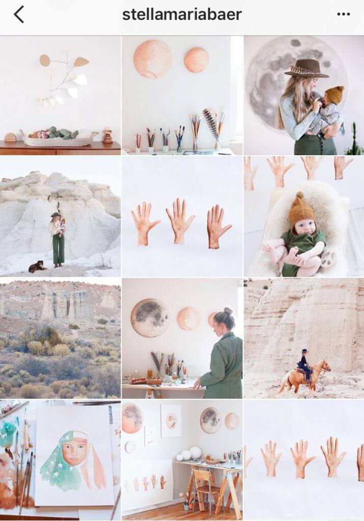
1.Squares
It is the simplest layout of the grid. Each post has its own unique meaning. As long as you have used the same filters and color combinations to keep it uniform. Your profile
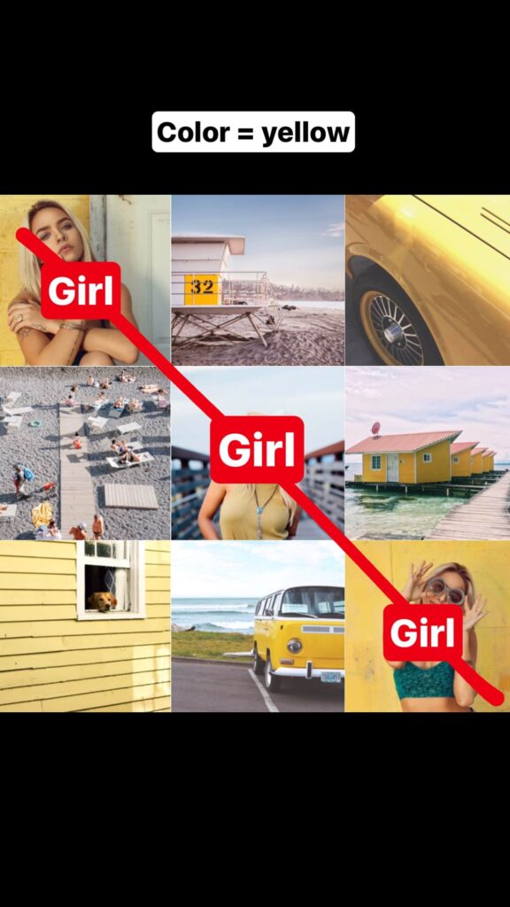
2. Diagonal
It is used by many instagrammers and creates a consistency in the flow of posts. The separation to choose what to post to create the diagonal effect comes from the type of photos as well as the colors you use.
3. Tiles (Tiles)
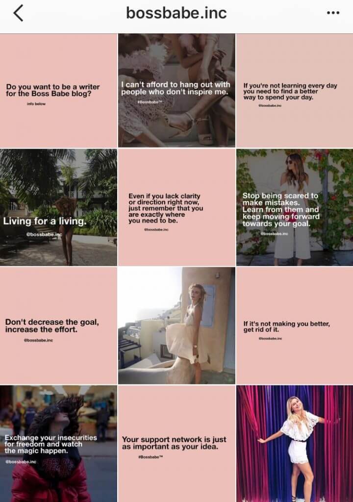
With this kind we treat each post like a tile.
The most common way to use it is by posting a photo, then a quote or an icon or emoji alternating one after the other, creating an immediate consistency in what you post. That way your followers will know what kind of post you'll make next time.
4. Horizontal lines (Horizontal lines)
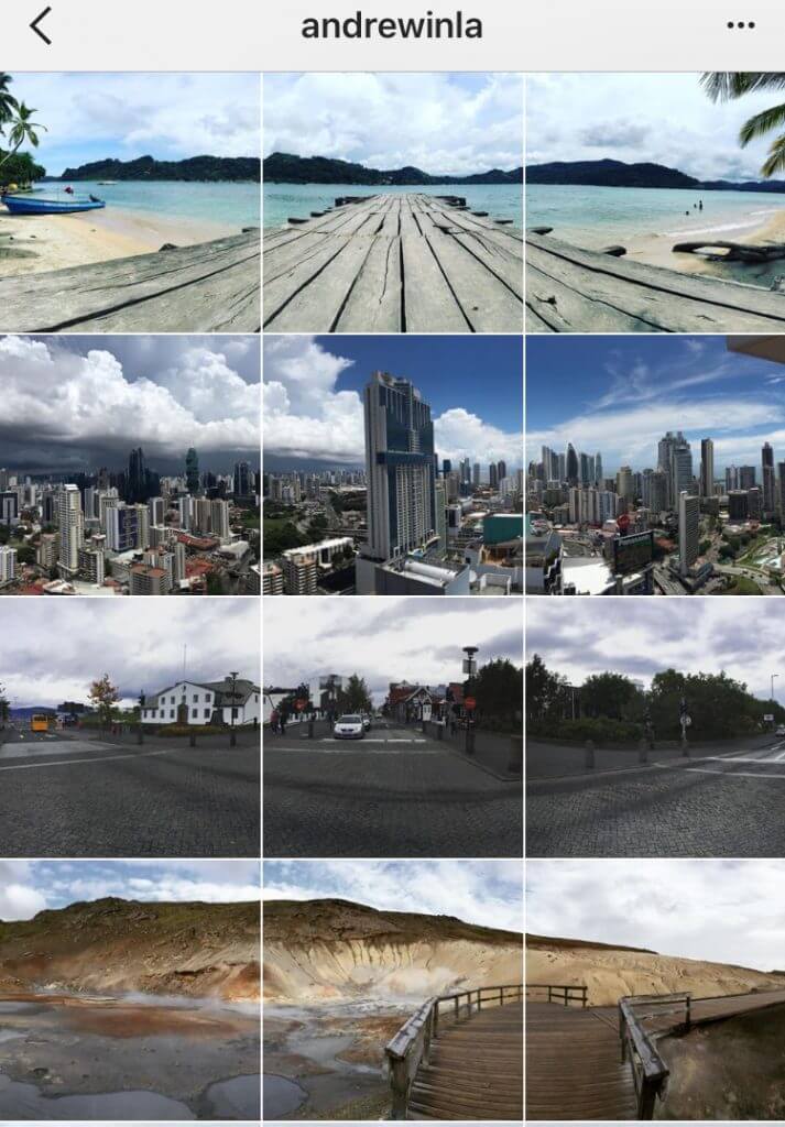
Another creative way of arranging your posts, friendly to the human being who in the majority of cases when looking at a line starts to observe it from left to right.
Here each line behaves like a story, a whole. Each story has its own coherence.
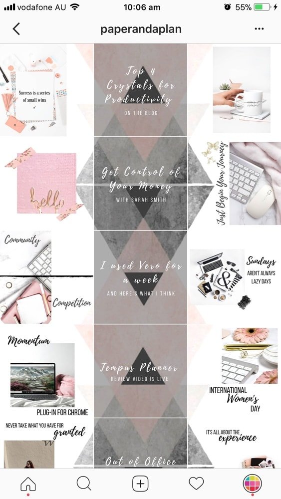
5. Vertical lines (Vertical lines)
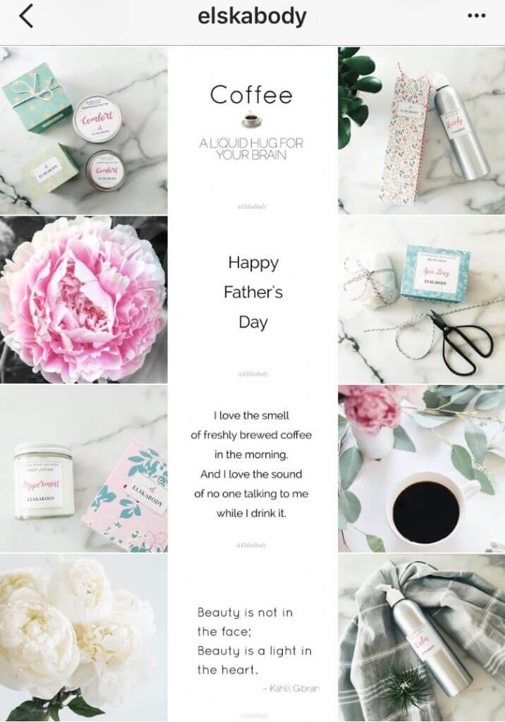
A special way to organize your posts with a special style that makes the follower who visits your profile want to browse more and more posts.
It is customary for the line in the middle to have a quote with a specific colour. This column created in the middle divides the profile into two sections whose posts in each line must be consistent with what the middle post in that line shows.
6. Rainbow (Rainbow)
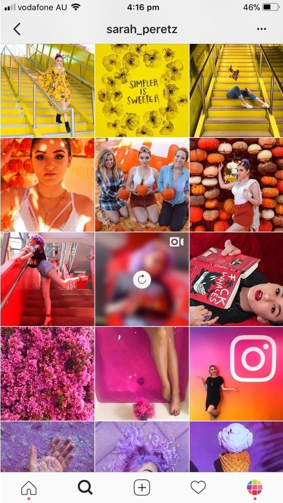
A way that requires more preparation but the end result definitely stands out.
The separation is based on colour. Every 3, 6 or 9 posts you change the color palette of the posts creating a rainbow-like effect!
7. Borders (Borders)
Another way that helps each publication to breathe especially with the right colors.
The most friendly and relaxed colour you can use is white, but you can experiment with any colour you prefer. Also the shape of the frame can be either square, rectangular even circular or anything else and the thickness of the frame on each side can also vary.
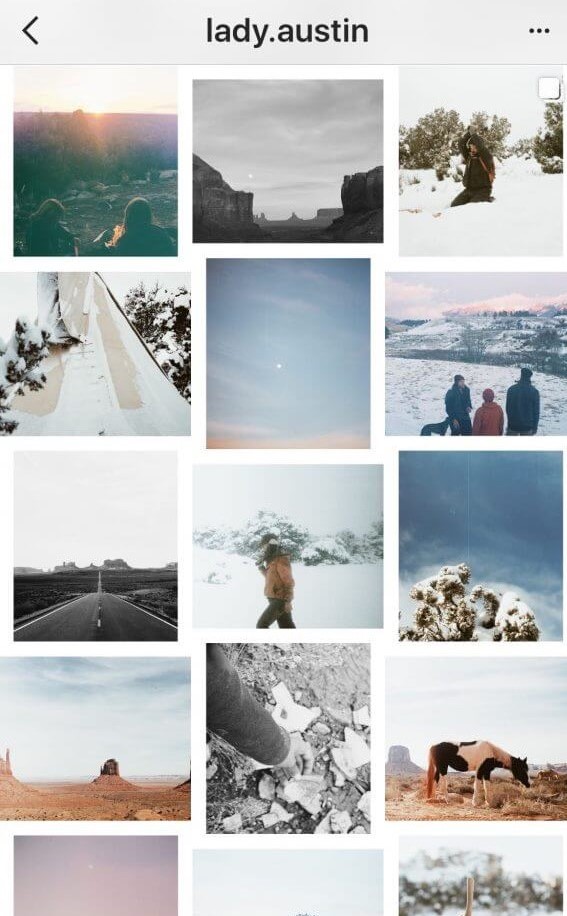
8. Puzzle (Puzzle)
A definitely controversial way of arranging your posts that requires you to pay great attention to have a perfect and unique result.
Here a large image is divided into smaller squares that together create the final image.
Great care is needed because if images or words are cut out, the result of a single post in the Instagram feed may not make much sense. Of course the explanation (caption) that we use in all Puzzle posts helps to understand what it is about. Besides, and a touch of mystery that the image evokes will definitely cause someone to visit your profile, see the whole image and if impressed, follow you if you haven't already won them over!
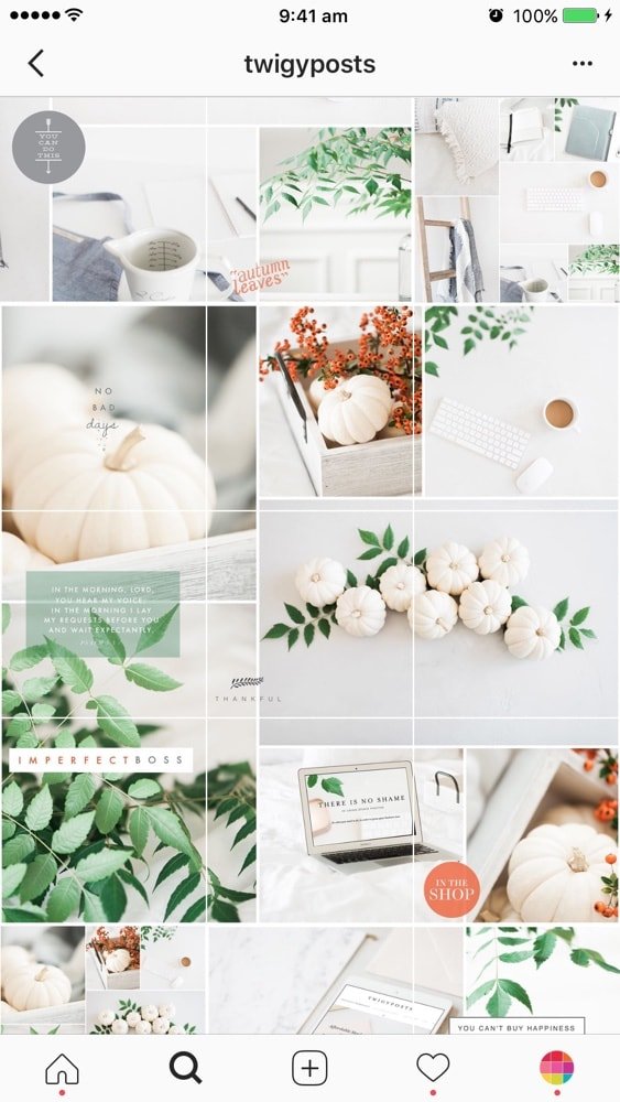
9. Mix
Here you go one step further! You can wisely use 2 or more ways of arranging your posts, surprising everyone who visits your profile!!
Experiment with all the ways of arranging your posts and choose the one that suits you best! Make your profile stand out!
Source:
www.plannthat.com/7-instagram-grid-layouts/
www.thepreviewapp.com/7-types-instagram-grid-layouts-planner-tips/
www.heyorca.com/blog/social-media-planning/the-ultimate-instagram-grid-layout-guide-for-2021/

