The Graphic Design or Graphic Design is defined as "the art and practice of designing and projecting ideas and experiences with visual content and text". Simply put, graphic design communicates certain ideas or messages in a visual way.
If we look around, graphic design is everywhere, from the wrapper of our favourite chocolate to the logo on the coffee mug. As well as in more modern applications such as web design, gaming, computer software and more. In fact, we see hundreds of examples of graphic design every day, and most of the time, we don't even realize it.
Just a few of the uses of graphic design include:
- Corporate identity/ branding
- Packaging (from water bottles to appliances)
- Printed material (books, brochures, magazines, newspapers, greeting cards)
- Web art (banners, blogs, social media)
- Movie, gaming and TV titles and graphics
- Web design. Companies are required to have a web presence. Therefore, graphic designers are required to create and maintain an aesthetically pleasing appearance.
The graphic design is not just beautiful. It is an important part of the company's brand identity. In graphic design, therefore, some basic rules must be followed in order to achieve a successful result.
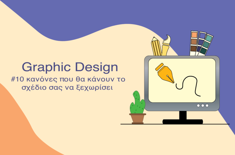
#10 Rules that will make your design stand out!
1. We have to realize that the graphic design is the graphic designer's means of communication with the world. The graphic designer must convey the message he wants to convey to the recipient and indeed in the first few seconds observation of the design, as the first impression is the one that the recipient does not forget.
2. To know the recipient of the project. Since the graphic design is a means of communication, the graphic designer must know who the recipient will be in order to identify and design, passing the appropriate message. Each graphic design project has a specific objective. This objective must be clear and fully understood by the graphic designer before he or she begins work. Because the designs are addressed to people, the psychology of the person is always the focus of our goal. The purpose of each graphic design is to activate specific emotions in a specific audience.
3. To use specific colour combination. The use of multiple colours may confuse the recipient. So it is better to use two to three main colours. The colour palette is defined before starting the project.

4. Another rule of thumb about colours is to choose colours that do not clash with each other because we will get the same result as when we combine several colours in the same design. Depending on what we want to achieve, we can use a specific combination. For example,
- The additional colours which create contrast and achieve a strikingly legible effect.
- The Analog colors create a sense of calm and balance.
- The triadic colour combinations are strong colour combinations. Usually one colour is the dominant one and the other two play a secondary role.

5. We do not fill the plan with data. The design we create must have room to breathe, there must be distances between elements, there must be symmetry in their placement, and finally we must leave a section empty (without elements).
6. We create a visual hierarchy which It 'leads the recipient' to notice which are the most important elements and which are secondary. For example, the Titles in a text are displayed with big letters, while the rest of the text is in smaller ones.
7. There are 7 principles which a plan must follow:
- Pattern
- Contrast
- Emphasis added
- Balance
- Scale
- Harmony
- Rhythm/ Movement
8. We use, legible fonts. The largest part of a design is usually the text. The graphic designer should choose a simple font so that the text can be easily read. Classic fonts such as Helvetica are popular with professional graphic designers because they look clear, are legible and ensure that the visual design does not overpower the words themselves.
9. The graphic design should be able to respond to the corresponding size to be implemented. For example, if the graphic is intended for a large banner, its elements should be equally large so that they can be visible and legible. While if it is applied as a profile picture in a networking medium, the size of the image should be correspondingly large. Climate so that it appears in full.
10. Before we start, we do Search. Always looking for inspiration. We get inspiration from our work. But there are so many resources out there to help us all develop our creativity and push the boundaries.
Use the above rules that apply to graphic design and start exploring and experimenting by creating unique and distinctive designs.